Hanna Andersson
In early 2016 Hanna Andersson, a beloved children’s clothing brand, was ready to redesign their eCommerce site. This was largely an opportunity being opened up by a need to replatform, but the design team saw it as an opportunity to modernize the look and feel and functionality of their dated site as well.
HA had design resources in-house who had recently formed into an official team to work on the website. That team was writing an RFP for development services to move them onto a new eCommerce platform but lacked the needed level of specificity about functionality that is needed to tightly scope such an RFP.
The team was confident in their visual design and interaction design skills but knew that a lot of the issues in their current site were related to product categorization, and a lack of understanding of the uniqueness of their product line. They also did not yet have any user research into how user’s shop or use the current site.
Ultimately they needed to create a vision for a new website taxonomy and shopping information flow that could serve as the basis for finding a technical partner and guiding a newly formed design team through a behemoth of a redesign.
How I helped
- User Interviews: I spent a week watching women buy baby clothing online and talking to them about their experiences, preferences, hopes, dreams, fears and advice for the HA team.
- Proto-Personas: Using the interviews as a basis, I created a set of proto-personas for the HA team to start to use as they design the site.
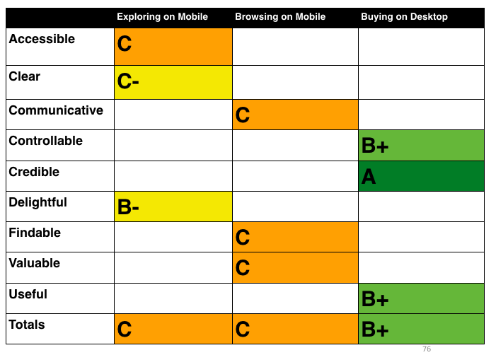
- Heuristic Review: I conducted a thorough review of the current eCommerce experience using the proto-personas and a set of prioritized tasks and principles (from my heuristic review framework)
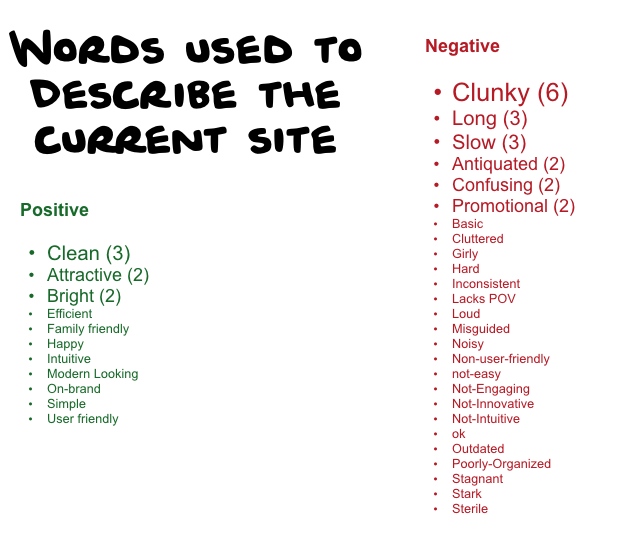
- Stakeholder Interviews: I spent a lot of time talking to the team at HA to understand the current working environment and process. I conducted one on one interviews with each team member as well as all of their primary counterparts across the organization to really dig into the website and team’s backstory as well as the opportunity they were being presented with the redesign.
- Alignment Workshop: There were (as always) decisions to be made and opinions to be had about where to go and how to get there. I flew to Portland for a few days to lead the team through these tough conversations and decision points so that we could move forward. I created a series of workshop activities to make sure everyone felt involved in the process and invested in the outcomes.
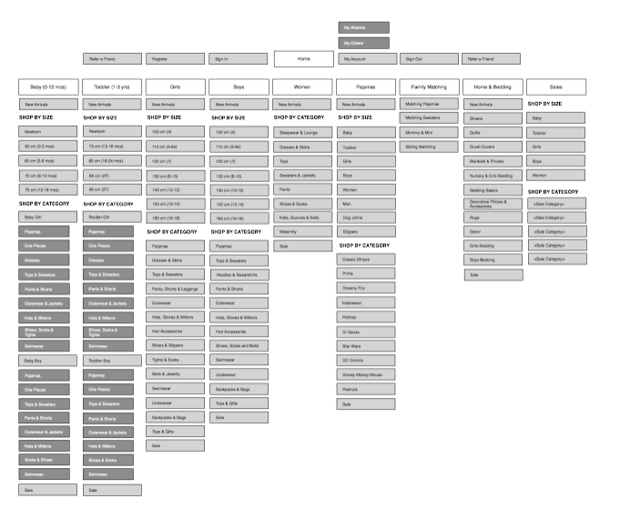
- Sitemap Development: I created a proposal for a taxonomy for consideration by the team. We worked through a round of tree jack testing to work out some bugs and finalized the map to move onto functionality.
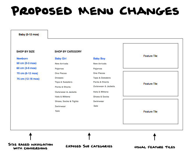
- Wireframe Development: I developed a set of wireframes to serve as the vision for requirements in the development of an RFP for technical services for development of the new site.
