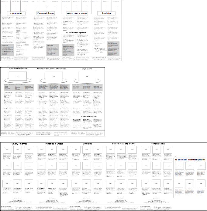
IHOP Menu System
After 54 years of business, IHOP had finally reached a tipping point in regards to the depth and breadth of their menu offerings across their franchise owner network. Coming in at sixteen glossy-syrup-sticky pages, IHOP customers reported that the menu was overwhelming and hard to make a decision from. IHOP wait staff across the country reported being asked for advice from customer’s on what to order at an alarming rate.
Add to that, recent health regulations introduced a requirement for transparency on calorie count and healthfulness of options on the menu.
The result of adding this information to the current menu was an over-crowded mess. And competitive brands had started to gain majorly in terms of owning breakfast.
And IHOP franchise owners were always asking for more options for customizing their menus to account for their own demographics and local taste profile. They didn’t just need another season menu redesign.
“They needed a whole new menu system, and way of thinking about how their business was aided through clearer information.“
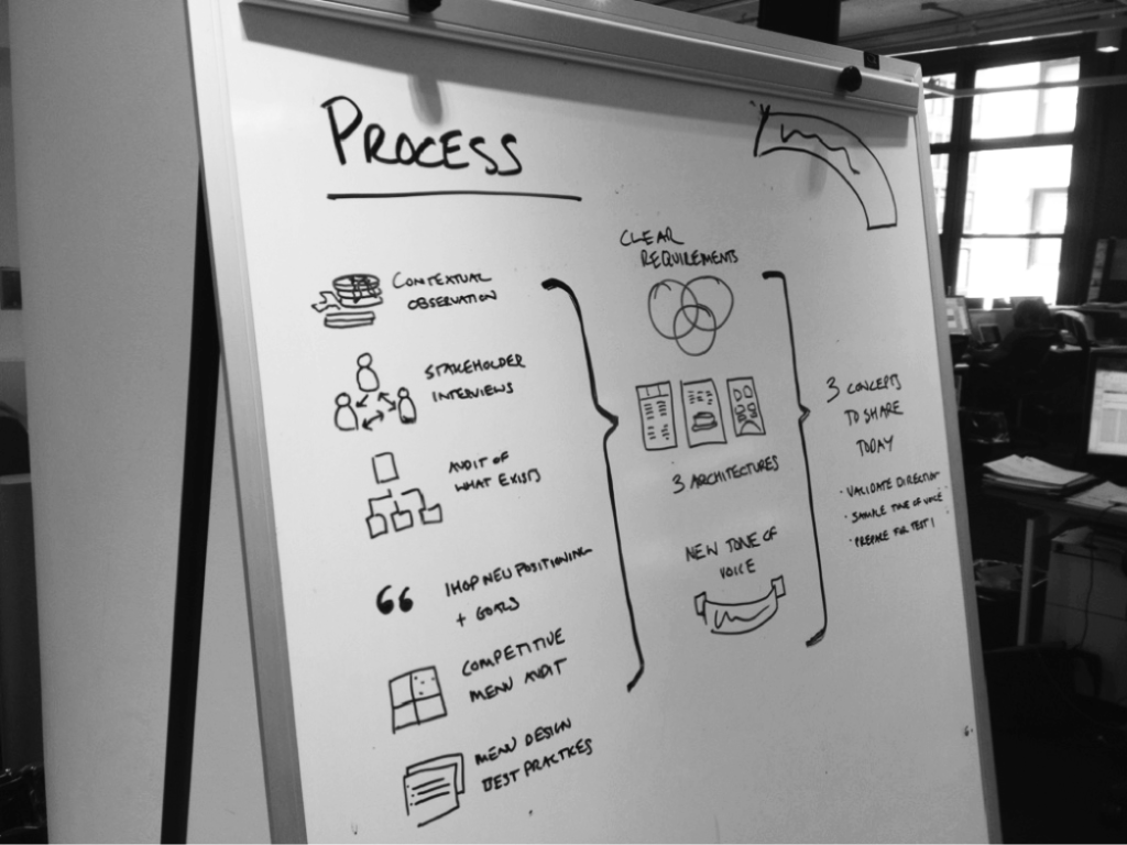
How I helped
- Contextual Observation: Eating pancakes and watching people eat pancakes at a variety of IHOP locations. Living the dream…
- Stakeholder Interviews: Interviewing franchise owners, IHOP executives and wait staff at selected top selling IHOP locations
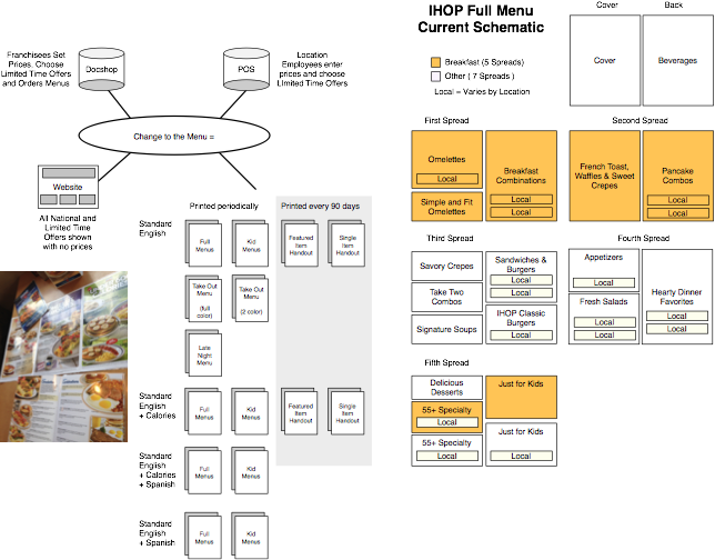
- Audit and Heuristic Assessment of current menu: Providing a schematic and system based view of the current situation allowed us to articulate the business value of changing, not just in sales but in efficiency of refreshing menus in the future
- Competitive & Best Practice Assessment: Looking at breakfast based chains as well as research studies into other menu redesign efforts
- Requirements: produced and diagrammed clear requirements for the new menu system, and the print products relationship to the point of sales, IHOP public website and private franchisee facing online menu ordering system
- Creative Briefing Documents: Downloading all this research effort into the minds of the creative team and making them documents to better understand pieces of the situation.
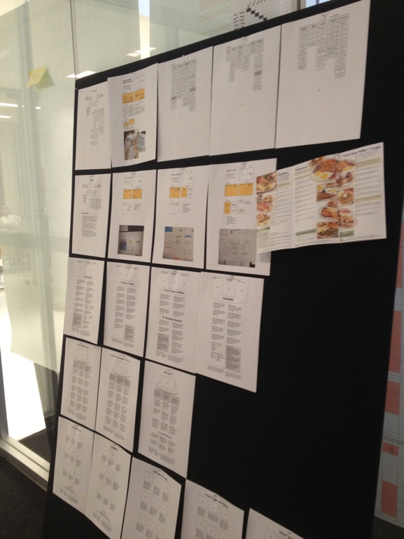
- Strategy Summary: Presenting the overall landscape and design challenger in a way that IHOP business stakeholders had an true understanding of the situation they were in and the options to move forward
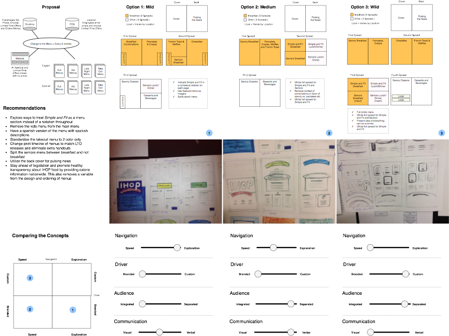
- Mapping: Mapping the high level structures that all three page level architectural strategies would work within.
- Wireframes: Drawing schematics for the page level details of how each menu concept should differ in visual hierarchy and interaction prioritization.
Results
In-store sales have increased 3.6% since the release of the new menu. Both the IHOP brand team and Future Brands, their creative agency, noted the information architecture approach as having turned the project into something “do-able” instead of something “insurmountable”
You wouldn’t expect it, but this redesign effort received quite a bit of press, much of which was focused on the unique and user centered approach that they took with the architecture 😉
Update: In 2020 the IHOP menu was redesigned again, after pressures from COVID led the brand toward a disposable menu option. Its amazing how the context of the present moment really does change the effectiveness of the architecture.
In 2013, taking IHOP from 16 pages down to 12 was a feat. In 2020, taking them from 12 down to 2 was a necessity. And with that necessity came the pressure needed to finally make some cuts to what was offered.
Now my 2013 architecture that raised sales as much as 3.6% in stores that implemented it is just seven years later being referred to in the press as a behemoth.
This is a good story of how change is always driven by current circumstances.