Dr. Brené Brown is an information architect (and so are her interns)
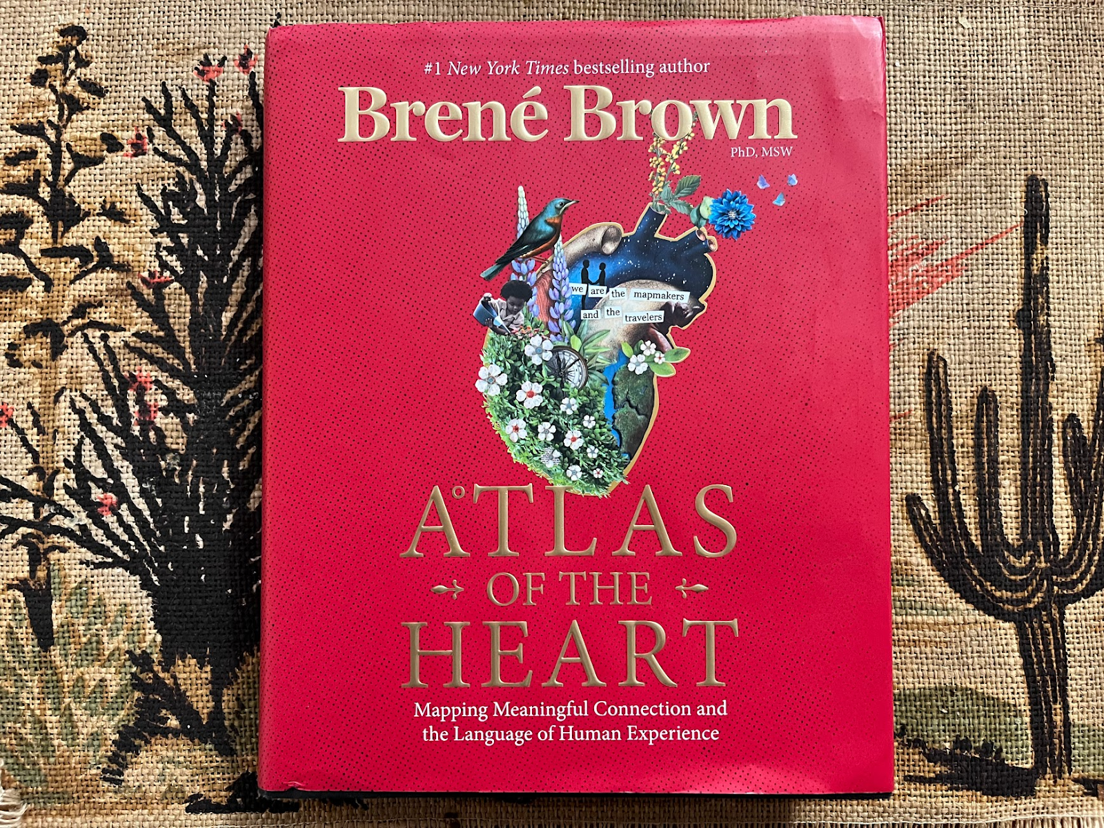
As 2021 came to close I received the most exciting package of my whole year. Atlas of the Heart by Dr. Brené Brown finally arrived. After months of waiting for its release, I dropped my kid off at his grandma’s and sat down to devour it. I want to be clear, y’all I have never had time on my calendar to devour a book.
The day the book was announced the title alone struck me full of much-needed hope. I am on a lifetime journey of desperately trying to navigate my emotions, and the promise of this book was very much welcomed in my life.
I wondered how Dr. Brown would tackle the gigantic subject of the spectrum of human emotional experience. As a reader I was curious about her findings, as an information architect I was equally curious about her tactics making such an unclear subject, clear.
The book outlines a literal atlas of human emotions. It is divided into “places we go” and once you arrive at each place, Professor Brown takes you around and shows you all the emotions in that place as if they are points of interest on a very cerebral field trip. It makes this incredibly deep subject matter so much more accessible than I have ever seen it tackled. And it’s also a beautiful book, the kind you can put on a coffee table for people to flip through.
While the content of this book is good enough to recommend based on the findings alone, in this post I want to discuss Dr. Brown’s tactics. Specifically I want to break down two information architecture decisions that are cornerstones of this work.
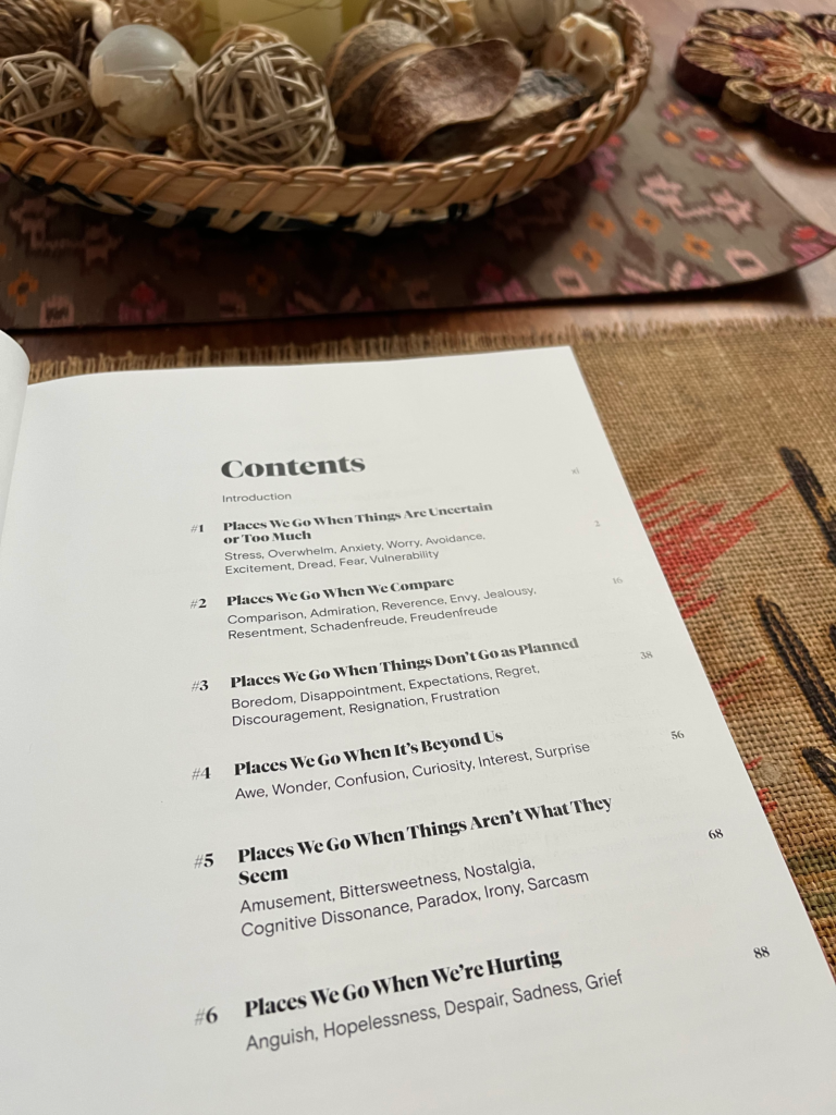
#1 A Structure that is Beyond Alphabetical
I hadn’t even gotten through the introduction when I learned that Dr. Brown and her team had made an extremely impactful information architecture change fairly late in the game for this book.
In the original version of the manuscript Dr. Brown presented the emotions to the reader alphabetically. But after a preview by two interns there was a new insight in favor of instead organizing the emotions in the ways that they are related to one another. This is where the whole “places we go” metaphor first got explored.
“At first the terms were in alphabetical order, but in 2020, our summer college interns told us that learning about the emotions and experiences was most effective when the terms were in groups that highlighted the subtle and not-so-subtle differences between experiences. They explained that grouping them based on how they relate and compare to one another reflects more of our lived experiences and enhances learning.” – Dr. Brown in Atlas of the Heart
This is a stellar example of information architecture, specifically in how it embodies the idea of playing with structure to get beyond the default way of thinking.
It reminded me of the innovative new approach to an atlas that was introduced in the 1990s by Richard Saul Wurman. In USAtlas, Wurman worked with Bonnie Scranton to consider the architectural needs of a road traveler’s goals and context and decided to do better than the standard alphabetical default that had been used for decades by Rand McNally’s Road Atlas.
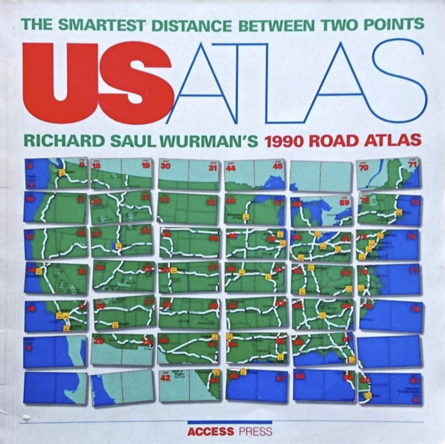
Wurman and Scranton organized the pages of USAtlas by the way the geography is traversed by car. As Wurman biographer Dan Klyn writes, “they organized the maps along major interstates and the idea that you’d only want to drive about 250 miles per day. So the contiguity of the US States was preserved in page-flipping.”
The old alphabetical way feels antiquated and silly doesn’t it? The geographical organization feels so obvious that it’s hard to imagine a road guide being alphabetical nowadays… although I suppose it’s hard to imagine a road guide at all nowadays.
Atlas of the Heart with an alphabetical structure could have contained all the same content as the book that was eventually published, but as a reader I feel so much better served by the structure of grouping associated emotions.
This structure provides an additional level of guidance and care for readers by taking into account when we might use this book as an actual atlas, like when we are feeling an emotion and desperately trying to give it a name and voice so we can address it properly.
An alphabetical list of emotions is no good when you don’t know what you are feeling, just like an alphabetical atlas is no good when you are on a road that passes through two states starting with two different letters.
#2 A Table Screaming to be a Diagram
Recently I heard Dr. Brown discuss an upcoming goal to work on the visual representation of one particular framework in this book with an eye towards making it more helpful. Especially in the context of broadening the audience for this work, particularly teens and young people.
“… try to make the framework for meaningful connection more user-friendly and more kind of I don’t know, tactical and actionable, and I think that also is going to be very helpful.”
– Dr. Brown on Unlocking Us Podcast (source)
Oh, wait – what’s that?! One of my writing heroes needs help making a framework more helpful?! Well that’s awesome, because I am on a mission to teach the power of diagramming when we feel stuck, and this framework is a great example of content that is stuck in a table while screaming to be a diagram.
In the final section of Atlas of the Heart Dr. Brown outlines a beautiful framework called “A Grounded Theory on Cultivating Meaningful Connection” that sums up the book beautifully, and also maps out this book’s relationship to all her other books and frameworks.
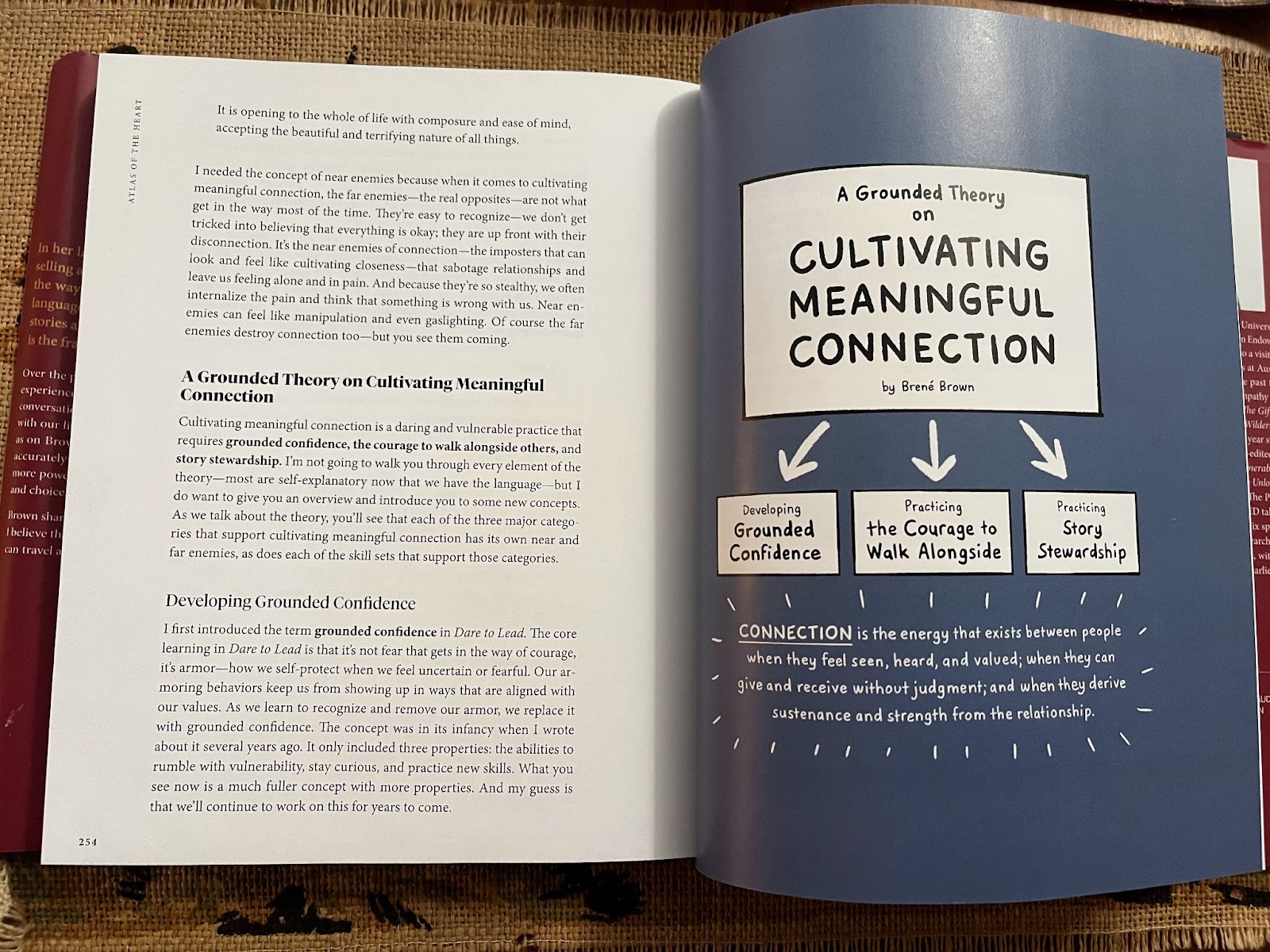
She presents three skill sets that we must work on in order to cultivate meaningful connection:
- Developing Grounded Confidence
- Practicing the Courage to Walk Alongside
- Practicing Story Stewardship
Each skillset is broken down into a list of associated skills. For each skill, there are also near and far enemies of that skill.
“Near enemies are states that appear similar to the desired quality but actually undermine it. Far enemies are the opposite of what we are trying to achieve” – Chris Germer, The Near & Far Enemies of Fierce Compassion as cited in Atlas of the Heart.
As a long time reader of Dr. Brown’s work, the content of this framework provided a major lightbulb moment for me. But as she alludes to, the table in the book is less than user-friendly.
The book presents this framework in a table that spans two spreads. Even before I heard Dr. Brown’s comments on the need to improve the usability of this framework as proposed, I had to make a diagram to understand the table fully. I was even momentarily convinced there was a copy-paste mistake because I didn’t understand that a single skill was being related to all three skill sets.
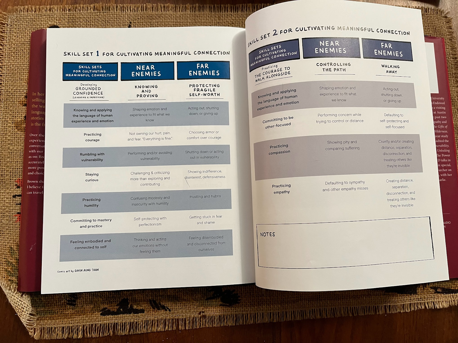
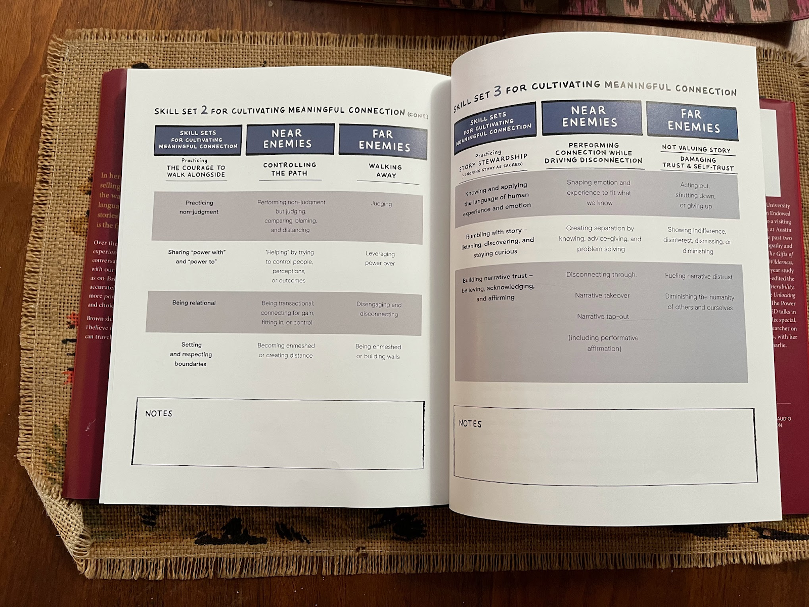
This framework may be the culmination of Dr. Brown’s career-worth of findings but unfortunately at the moment it’s stuck inside the wrong visual representation to be helpful.
The main opportunity I see here diagrammatically is to visually differentiate skills from their near enemies and far enemies to reinforce the desired behaviors and warn against the non-desired behaviors.
Currently the skills and their near- and far-enemies are all visually treated the same, which makes it cognitively heavier to understand what are the desired skills vs. non desired near and far enemies of those skills. This requires the reader to return to the column header to parse meaning repetitively in order to make sense of the content.
In my opinion, after playing with it, this content is wanting desperately for the introduction of visual hierarchy and association to further enforce the definitions of the core concepts that make up the information architecture of the framework (e.g. skill sets, skills, near- and far-enemies)
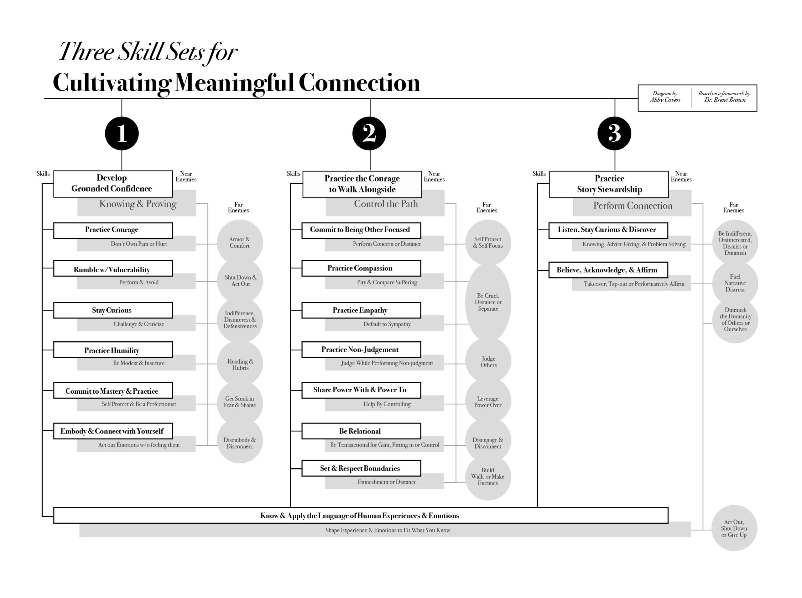
A suggested diagrammatic form I came up with can be seen here (and explored at a larger size here). In this diagram, I created a secondary visual style for the non-desired behaviors (near and far enemies) and visualized them as a “shadow” taxonomy of shadow-skills in relation to the desired skills the framework is meant to encourage.
I shortened the labels and made them more actionable by dropping the -ing making each more “tactical” as a direct action. I also moved the single skill that cuts across all three skill sets to the bottom of the diagram to better visually represent the foundational nature of this skill. Bonus: the skill that cuts across is “Know & Apply the Language of Human Experiences and Emotion” which mirrors the information architecture truism to control your vocabulary as a foundation for making sense. Yahtzee!
Just like the alphabetical atlas example, the same content can be made more effective when simply given a structure that reinforces the meaning of that content. And that, friends, is the magic of information architecture.
Now I want to be clear here. I am not Dr. Brown, so I don’t actually know if this diagram is a more helpful version for her intention towards her readers. I also don’t think that where I landed is the best or only visual representation that could be helpful for getting this information to people who are reading this book. I would need to know more to do better here. But I think I’m onto something. And gosh, I would LOVE to nerd out with Dr. Brown about what I have proposed here and about the power of information architecture.
So… with that dream and a whole lot of bravery, I will end with the equivalent of a message in a digital bottle headed her way.
“Hi Dr. Brown!”
First, Atlas of the Heart is a beautiful book and a wonderful culmination of your work. It means the world to me and millions of others as we make our way through the jungles of our emotional experience. Thank you for making us this atlas for our trek together and alone.
Next, if by writing this post I happen to be the first one to tell you about the term and practice of “information architecture” here’s three points I want to make sure to cover:
- Information architecture (IA) is the way in which we arrange the parts of something to make sense to our intended audience. There are information architecture decisions all over everything (i.e. books, websites, podcasts, events etc) and most people are practicing IA as part of their everyday life without knowing the label.
- You don’t need to know that you are practicing IA by name to be great at it. Your work is an excellent example. But knowing the label can expand your tool box, community and google results in valuable ways to get even better at it.
- There is a growing community committed to spreading IA tenets, processes and tools to as many sensemakers as possible. We call ourselves information architects. I think you are totally one of us and I would like to welcome you into our community! If you ever want to nerd out, OMG yay. Let me know.