My IA Heuristics Journey
It is late spring 2011 and I am sitting in Dan Klyn’s kitchen. It smells like blueberry pie and startup rollercoaster tracks. Dan and Bob are three months into their new company, The Understanding Group. It is my first week full time; I am living out of a suitcase on my way to New York City. We have a client that we recently started to work with and we are excitedly discussing the heuristic assessment that we are about to start for them.
Once we stopped trying to make a heuristic principle for each letter in U.N.D.E.R.S.T.A.N.D.I.N.G, our conversation turned serious and we unearthed that neither of us really had a format we used over and over again in heuristic assessment. Our past experience had teetered between being told the format to use, using Nielsen as a guide and piecing something together from various sources based on context.
The Why
We did some brainstorming about what was out there and somewhere between Nielsen and the ISO standards it hit us, we needed to create a tool that didn’t exist yet and it needed to be based on what had been done to date by a lot of smart folks.
We identified that what was available was:
1. In many cases 5+ years old, meaning mobile, social and cross channel were not considered
2. Written for practitioners and students, not clients and partners
3. Not presented in a teachable nor evaluative format
Shortly after that I was asked about subjects I could teach at General Assembly and they mentioned wanting any topics around “best practices” that I could think of. And then submissions for Interactions 12 opened.
Too many windows of opportunity opened at the exact right time. I had my assignment. Dan agreed to play devil’s advocate and stay out of my way while I did a deep dive.
The What
It was actually a pretty simple information architecture assignment when you break it down. “I just IA-ed the IA.”
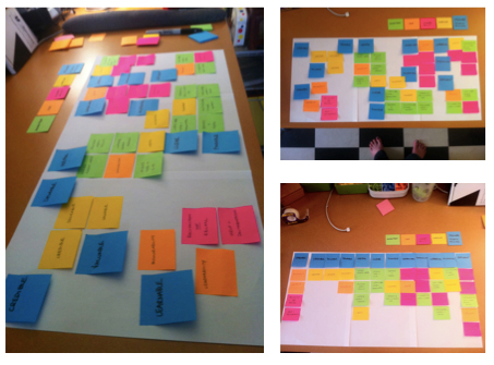
I started by using post-it notes to cluster map all the individual principles from the five historical sources to see what was the same and different across 20+ years of thought-leadership on the subject of information architecture, user experience and usability heuristics.
My five sources, yielding over 50 individual pieces of wisdom were:
• Nielsen/Molich’s Usability Heuristics – 1990
• Lou Rosenfeld’s IA Heuristics – 2004
• Peter Morville’s UX HoneyComb – 2004
• ISO 9241 Ergonomics of Human System Interaction – 2006
• Resmini/Rosati Pervasive IA Heuristics – 2011
The end product was a matrix illustrating the ways in which the historical sources I was referencing laddered to the principles I was suggesting.
I shared my final results with Dan and the rest of my team as well as Peter Morville, who we had started talking to about working with us as a strategic advisor. I went from 12 principles to 10 in those conversations.
And yes, I still argue with myself about where things landed as any good IA would.
From there, I created a series of questions that I felt were needed to holistically consider the points raised in the source material as well as other relevant considerations for the cross-channel world we work in today.
The Who
The language and question flow are designed to be applicable to most digital initiatives. But I believe that the same format could be applied to a non-digital experience, should the reviewer be creative in interpretation of my line of questioning.
My expected user base is Information Architects, Interaction Designers, Designers, Project Managers, Product Managers, Developers, UX People, Researchers, Business Owners, and Decision Makers.
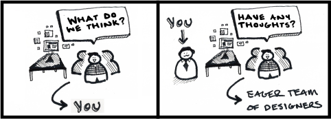
In other words, anyone who has ever been in either of these situations:
The When and How:
Since the creation of the principles, I have used them for 3 purposes and have developed tools for each that I want to share. I do recommend following these in order if you are trying to impact an organization affectively.
1. Teach heuristics as the basics of how to critique digital work
The deck that I have available on Slideshare has been “play tested” with a variety of audiences from business people with little to no experience in digital to Dan Klyn’s nine year old son. Funny story, his only trip-up was when I asked him to define the word “clear” by any other word. “It’s just, you know… clear” I will never forget seeing the frustration caused by asking a brilliant little man to simplify the adequately simple. It was a convicting moment.
IMHO “Expert Reviews” don’t have to be black magic. Heuristics can be things we talk about out loud with consistency and purpose with non-designers to push our work forward together. They can be a part of our shared language of critique.
Because by getting really good at talking about what we can create today, we will push beyond where we are and to me that is where innovation lays in wait.
So if you have blank stares in your critiques or partners that just don’t “get” the whole “what is good” in “digital” thing. I urge you to download this deck and setup a brown bag session to present it.
2. Evaluate the Current State of a Product or Service
I was recently asked to teach graduate students at U. Michigan how to evaluate a service-based organization’s digital offerings using the principles I had laid out. After giving them an hour long lecture using the deck I mention above, we broke into smaller groups and worked through the process outlined in this deck.
3. Critique what is about to be tested.
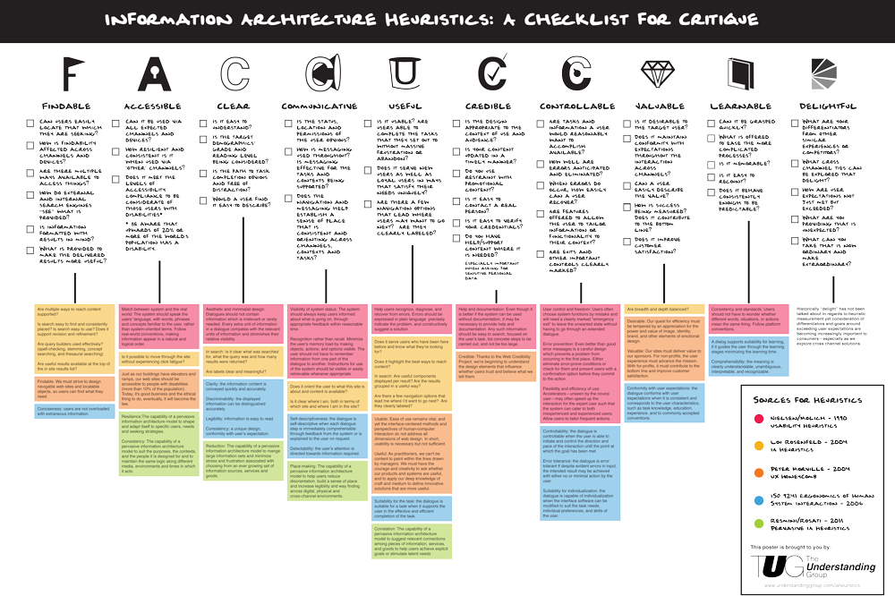
Using the heuristics in hypothesis formulation for what you may hear from users. To aid in critique I designed a poster that we plan to use in advance of user testing at The Understanding Group.
The poster references the original source material color coded in line with each principle. Also listed are the thought-starter questions for each principle.
Now, what I am most looking forward to is hearing from anyone who is using these principles in their work.
UPDATES:
- In 2018, the Understanding Group finally sold the last of the original poster
- In 2020 I redesigned the poster with a fresh new look focused on accessible readability and it is now available on my Etsy Shop as a print poster or digital workbook


