Diagrammatic Technique & Critique
I have made thousands of diagrams during my career as well as critiqued the work of hundreds of students. Diagrams may look easy, but they are in fact quite HARD to get right.
Diagrammatic Technique, or how to make a diagram ‘good’, is much more art than science and it is one of the harder parts of information architecture to teach and to learn. It takes playful curiosity and some guidance.
I find that diagrams also often fail to be critiqued against the right set of criteria, often over prioritizing the glossiness of the presentation over the clarity of the delivery.
To better teach diagrammatic technique and teach my students to better critique their own work and the works of their peers, I developed a few tools I have now made available in my Etsy Shop.

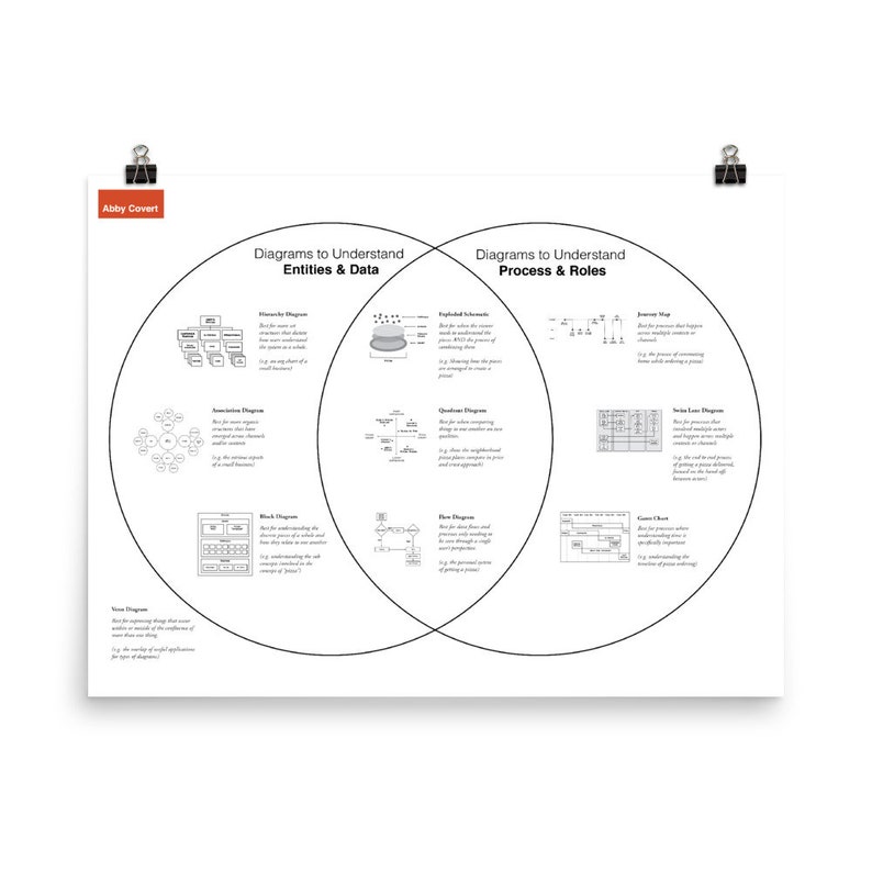
Common Diagram Types Poster: Showing ten common diagram types arranged to give some guidance on when each type might be most effective. Print Poster ($30 USD)| Digital Download ($15 USD)
You can read all about the beginnings of this diagram journey in a blog post I wrote about it back in 2015.
