How I made sense of my mess
After practicing information architecture professionally for more than ten years, my mess was how incredibly hard it still was to teach and discuss IA outside the bounds of web navigation design.
The mess I saw emerging was that so many things we use and places we experience everyday are a total-nightmare-mess. In my opinion it wasn’t just web navigation that could use better architectural thinking.
In fact as a part of human life in 2014, we are bombarded with misinformation, disinformation, no information or too much information at pretty much every turn that we take.
I decided to write a book about information architecture for everybody.
Step 1: Write a personal manifesto on IA and life
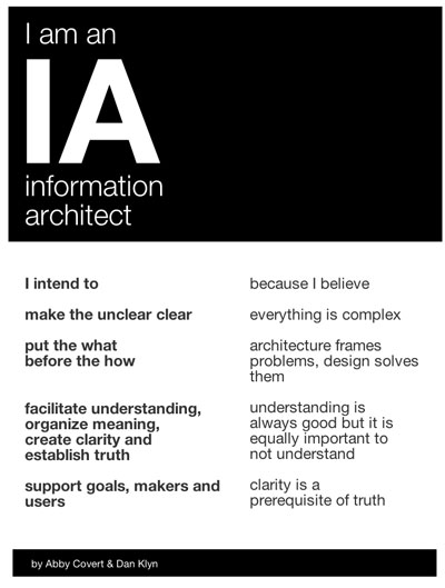
In the fall of 2012, Dan Klyn and I published a manifesto poster on IA called “I am an Information Architect” — it contained the “hooks” we wanted to collectively hang our writing and research work off of.
Shortly thereafter, I was told by a hero of mine that I should write the “Eat, Pray, Love of IA” — and so with our manifesto in hand, my first book concept emerged as stories from my career to hang on each of our hooks.
My favorite story was about the meaning of cocktail straws. Which I should have taken to mean that I had spent too much time in my late twenties in bars.
It was a good draft to get out of me but these 20+ pages entitled “I am an Information Architect” were only read by a few close friends and colleagues.
Everyone’s reaction was similar:
This is great stuff to get out, Abby. Now write an actual book!
Step 2: Write a chapter a week and make students read it
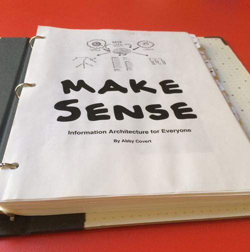
The second concept was a book I wrote week-by-week during the fall semester of 2013. I was teaching an undergraduate studio class called Intro to Information Architecture at Parsons.
I am proud of the results of this book and teaching with a textbook proved much more effective than from slides alone. Also many of the examples and diagrams that are in the book today were first developed during this time. Alas, very few of the actual words from this 40,000 word, nine chapter monstrosity made it into the book I ended up with.
Step 3: Pretend to go back to graduate school
In spring of 2014, I was invited to teach a thesis class at the School of Visual Arts, in the Products of Design department. I developed a class that used the lessons of information architecture to help 15 thesis students maneuver their way through the final semester of their year long projects.
In developing the syllabus, it occurred to me that I was in a very similar position to these students. I had been working on “the book” for months and all I felt like I had was a mess of things that were not the thing I wanted to make.
I made them a map of how we might get through such a mess together, and I started doing all the assignments with them and blogging about the lessons I was teaching them every week.

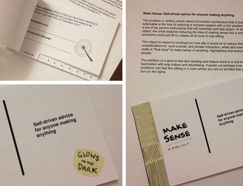
What if it were a workbook?
I started by thinking how silly it would be to reduce important considerations to such a small, and private interaction as a workbook. Would that insinuate that it really is “that easy” to make sense of anything? Then I started to really ask myself “Would the world be a better place if it were that easy?” And I decided the answer was yes. I also came to believe that a workbook format properly highlighted that almost everything that is “in the way of clarity” is put there by people. In this particular prototype, the addition of a glow-in-the-dark binding and feature burst was an obvious nod to my ongoing fascination with pop culture and advertising.
How small is too small?
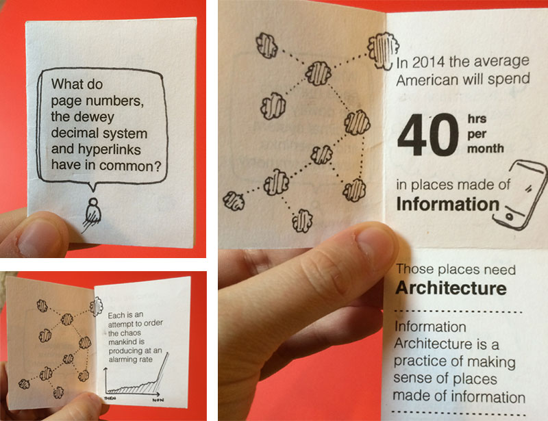
Next, I wanted to challenge information architecture to be a simple enough concept to educate people on in an elevator. The intent of this tiny book is to act like a business card for people who seem to be intrigued by the words information architecture, but do not have the words to describe what they think it means.
How young should we start talking about meaning?
Throughout this process I have pondered the right age to introduce information architecture concepts and tools. To put something out into the world to test with, I created this short and activity-based book aimed at parent and child understanding a core component of Information Architecture, ontology.
What if I made a map of it?
As I have proceeded through the writing, editing and re writing of this book I have had a few distinct moments where I realized I wasn’t “eating my own dog food” — each time I took the step back to apply the lessons of IA to the book itself the results were staggering. Two such moments are the map I made for my students to guide them through the semester and the map I made for myself to write the book by which you can see below.

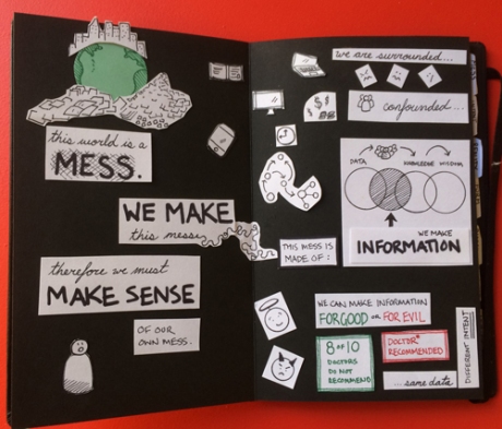
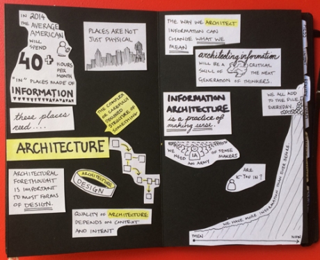

With this map, an idea for a book had emerged. This time it felt like the book I actually wanted to write. A book about making sense of messes.
Step 4: Make a detailed outline & write a lexicon of terms
In June 2014, I made a map of the book I wanted to write and started a new outline of 4×6 notecards. I wrote each lesson on a notecard and then wrote a few sentences about the lesson and any examples or ideas I had for explaining it. I created a 100 card set in a word document that was divided into 7 chapters, all of which remain today.
I also wrote a list of words and definitions I would be using throughout the book to keep myself on track. Writing a controlled vocabulary for teaching IA was one of the most fun parts of this project for me.
Step 5: Hire an Editor
In August of 2014, I hired the brilliant Nicole Fenton as my development editor. I gave them my 100 card stack and asked for feedback. What they sent back was an amazing array of thoughtful questions, suggested edits and considerations.
They also wrote me a style guide to remind me of things we had decided about sentence cased headlines, oxford commas and other writerly stuff I would never have considered without them. With their guidance, I set off to write the first full manuscript.
I then recruited 15 readers to provide feedback on the manuscript. With their amazing and detailed feedback in hand, I did a round of rewrites. During that period, much of Chapters 1 & 6 were rewritten and many crucial tweaks were made to the other 5 chapters.
Then I handed the whole thing to Nicole to work their editing magic on. The manuscript I got back was clearer than I thought my words could be. I could not recommend Nicole more highly if you are seeking a wordsmith with a sharp-mind and a strategic sense.
Step 6: Make it look like a book
It was finally time to make the final decisions about how the book would look. The design student in me was thrilled. The business person in me kept begging me to hire a freelancer instead of taking it on myself.
For about 2 months after writing my 100 notecard stack, I had actually convinced myself that the final book would be a stack of 4×6 notecards held together with a binder clip. Alas, the costs and complexity of doing so were mind boggling, so I moved on to a more typical layout of 5.25 x 8 paperback.
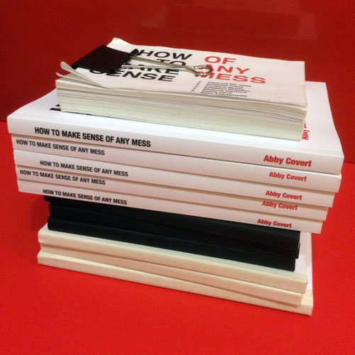
Into InDesign I went, and three days of eye-bending fun later, out a book layout came. Several proof reading rounds later, page numbers were locked and I was ready to index. Insert three days of brain-strain and out came an index, which also mashed-up nicely with the idea of having a lexicon, so I designed it as an indexed lexicon.
Step 7: Negotiate a myriad of tantrums
- Tantrum 1: Imposter syndrome sets in and I decide I could never write a book anyone wants to read anyways so why try… whomp whomp.
- Tantrum 2: The book is never going to be done and everyone knows it
- Tantrum 3: I don’t know how to use InDesign, what happened to Quark, wah!
- Tantrum 4: What do you mean justified text is harder to read, but it’s so pretty!
- Tantrum 5: The great book spine debacle of 2014
Step 8: Try to hold breathe until launch, but fail.
I have had at least 4 days when I have woken up and thought: today will be the day I am done. All of those days were met with “meh… not done” by bed time.
But now it is done and you can read it, and tell me what you think. And all I can do now is remember to breathe and start to consider what the heck to do next.
