Vertical Labeling for Diagrams
A diagram is a visual representation that helps someone understand something. By that definition, you have probably already encountered or even created some diagrams today.
If you haven’t noticed or encountered a diagram yet today, good morning and allow me to serve you up your first healthy helping of diagrammatic goodness.
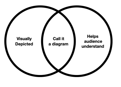
The above is called a Venn Diagram. This type of diagram is good at showing the result of overlapping concepts. It is also good for the memes.
I am writing a book about diagrams.
As a teacher of and writer about information architecture, I have covered diagrams and their purpose before. I have shown lots of examples and templates. I have even started to tackle some of the do’s and don’t. But having recently started to teach more diagrammatic technique and critique to students, I am in a whole new world of complexity.
I want to start with something that comes up early and often when teaching someone to diagram. It absolutely floors me how many times I find myself compelled to tell someone their labels are oriented…er, weird.
If you have ever made a diagram, you have likely experienced a moment where you believe that a label might need to be rotated to best fit into the diagram that you are making.
A seemingly basic question in this moment is:
“What is the proper direction to rotate a text label in a diagram?”
We humans have been doing this diagram labeling thing for a long time and certainly there must be a definitive answer to this basic question…right? Furthermore (huff huff puff puff of certainty), there are only so many possible degrees you might rotate text in one of the following three ways.
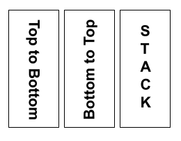
- Top to Bottom (also known as descending), any angle where the start of the phrase is above the end.
- Bottom to Top (also known as ascending), any angle where the start of the phrase is below the end.
- Stacked (also known as marquis), where the word or phrase is set with one letter per line.
If one of these is feeling like the right answer already, always and forever, I ask that you hit pause on your decider function and stay with me for approximately 2000 words more.
I am here to show you the magic hidden in the complexity of diagrammatic decisions.
Diagramming involves making LOTs of decisions. Every one of these decisions impacts the diagram’s ability to be effective for its audience. In my experience, people either convince themselves that these are all design decisions or that diagrams aren’t about design at all.
I have made, and diagnosed in students, both of these mistakes
In my experience, when we are diagramming we are doing more than just designing. We are thinking deeply about how people process, understand and best grasp concepts and information. We are making architectural and linguistic choices. We are making choices that depend on what our users already know and what they are therefore likely to understand without too much explanation.
I am finding diagrams so fascinating to research and to teach because diagrammatic technique in my experience sits at the confluence of several practical areas of study including information architecture, wayfinding, cognitive science, typography, linguistics, and cartography to name just a few.
The most interesting part of this being what happens at the intersection of these fields in specific moments where we are making diagrammatic decisions.
For example to answer the question at hand about proper text label rotation, we would want to become familiar with principles coming from at least three areas of study: linguistics, typography and information architecture.
If you are coming from just one of these fields, you might have even convinced yourself (like I had) that there is an easy answer to this question.
Easy Answer #1: You might believe (like I did before doing this work) that rotating to match the direction of the element being labeled is always proper because the focus should be on enhancing clarity of the label and its relationship to the element, always.
But we will quickly be taught the fallacy of always when you eventually experience times when that rule breaks from a loss of readability. Times when it is no longer clear to follow the exact directional line you are labeling.

Easy Answer #2: You might believe (like I was taught in Typography class) that the Top to Bottom orientation is most proper for vertical orientation of English type because it best mimics the anticipated clockwise rotation of being…er, pleasing to the eye.
That is what typography is afterall, much more opinion than rule.
If you need this kind of express permission to disobey typography — allow me (a design degree holder) to relieve your fear by confirming what most everyone encountering graphic design and typography comes to feel instinctively: there are no right answers when it comes to type.
There are risks we are willing to take and reasons why.
Yes I said it, don’t at me.
Easy Answer #3: If you were trained to make process diagrams you were maybe handed a standard (ISO 15519) to follow that says bottom to top is always the way should the need to rotate arise1. And if you make charts of quantitative data, you might also believe that bottom to top is the only way to rotate type because of your ideas of proper axis labeling.
Easy Answer #4: If you are someone who has studied readability more deeply, you might warn us that ideally, the proper rotation of a label should be determined based on the ideal reading direction of the intended audience. But you also might inform us that readability is very much influenced by the orientation of the viewer to the thing being viewed (in addition to the viewer’s natural inclination)
This could be why you find wayfinding and signage advice generally being to set signs being read from the ground from bottom to top, and signs someone approaches at eye level from top to bottom.
Ok, now really … which way is the right way?
If you were merely exposed to one or more of these easy answers and were protected behind the false sense of security the word “proper” provides, you might be convinced one way or another as well that there is just one right way.
You might also, should you google it, find many people in message boards and blog comments assuming around the idea that there is a “well, duh” standard to rely on here:
“Just use the rotation of book spines in the local culture or language of the intended audience” – says everyone without thinking too hard about it
And yet, if you look further into the ‘because reasons’ of book spine rotation, you will find all sorts of nifty background tidbits as to why different languages might think about the orientation of books differently — resulting in spine design (and opinion) differences across cultures2.
While I can confirm that this contextual knowledge about book spines in different locales is indeed interesting and a rabbit hole that I might continue to fall down at another point, I can also confirm that it is absolutely not the right way to think about the way to rotate your diagram labels.
Proposing a framework instead of saying: “It depends”
I’ll be honest, I could have let this go. I could have gone with an “it depends” response and moved on with my life. But here’s the thing — people feel anxious about this choice (or mess it up for their users) all the time.
They don’t mess it up because they want unreadable or less clear labels, but because it’s a consideration set that hasn’t been made clear for them yet.
Having now done some information architecture work on this thing, I can confirm it was kind of a mess to get through. I can also confirm once again that digging deeper into your own assumptions about something you thought was a standard to lean on is worth doing. Sometimes it will change how you see your work and the world.
Instead of a recommendation for something that always works, which I want to be crystal clear: I do not think exists, I offer instead the following framework for you to understand three main considerations you might want to have when deciding how to orient the labels in a diagram.
While the TLDR is “the proper direction for vertical rotation of text deeply depends, because reasons” the longer explanation is one I hope you stick around for.
Determining the best orientation for a label on a diagram depends on three main considerations:
| Readability | Understanding the language, context and culture of intended viewers |
| Line Length | Understanding the impact of the length of labels on typographic harmony |
| Edge Direction | Understanding the inherent directionality of the element being labeled |
Consideration #1: Readability
When making things for humans to read, it is kind to prioritize readability. Diagrams are no exception.
Rotation has consistently proven to have an impact on the readability of text in short and long form. Studies of this date back to the late 19th century3.
Interestingly neither direction has been proven to be “proper” from an academic standpoint. So if you, like many, assume that your default is the default, remember that you are not your user.
Rather than one standard default to apply to all contexts, mediums, intentions and cultures, text content has been proven more recently to be most readable when set to meet the specific readability needs of specific users in specific contexts4.
Science tells us to do everything in our diagrammatic power to NOT rotate our labels at all and if we do, either way we go, we better pay attention deeply to our user and their context.
Me: “What a good piece of advice. Thank you, science.”
You: “Ok. But no really, we didn’t answer the question. Which way should I rotate my diagram labels to be… proper?”
Me: “Well before we get to that, let’s stop and reconsider rotation all together!”
Aha! Didn’t see that coming did you? But I see a lot of rotated labels that don’t need to be rotated. So yeah, double think that before we move on to consideration #2.
Huzzah, I got you to NOT rotate it …right?!?!
Ok, my work is done here!
What!?…you really still need to rotate it? Frack. Ok. Let’s talk about your other two considerations.
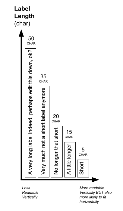
Consideration #2: Line Length
The next thing I want to talk about is the line length of the label you are setting because it matters deeply how long the label is when deciding how to set it. The longer your label, the harder it will be to read when set vertically.

So here is the thing that gets me about line length: the generally accepted ideal line length5 for readable body copy (50-75 characters) is already too long for labels – especially when set vertically.
So that begs another important question: What is the ideal line length for vertically set type?
And then it dawned on me…the shorter the label, the more likely it will better read vertically, sure. BUT also the more likely it is to fit horizontally with not too much more design finesse than rotation would take.
Dang. You caught me, I am trying to get you to not rotate the damn label again.
Did it work?
You decided that the short phrase or single word you thought you needed to rotate is better set horizontally, right?
No?!?! You still think rotation is the way to go.
Ok, there are times when I have also found that to be the case, so I will be taking one final swing at being helpful here.
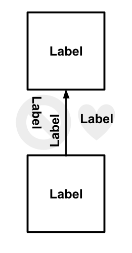
Consideration #3: Edge Direction
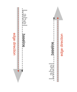
There is this squishy concept I am currently exploring as I teach diagramming called edge direction which I am at the moment defining as “the rotation of a label’s baseline in relation to the edge of the element being labeled” — if someone has a name for this concept already, PLS let me know, I have not yet run across it.
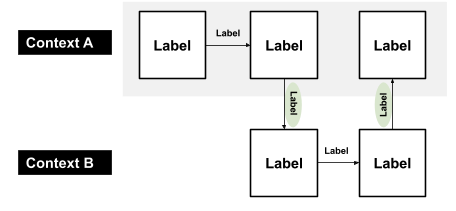
I want to define this concept because in my experience there are directional cues in a diagram that need to be considered in addition to the habits or preferences of the viewers language or cultural context. These directional cues exist in the element being labeled, but also in the directional connection to any other elements in the diagram.
When we work with directional cues to align our edge directions, I posit that we make for more understandable labels. When we reverse the edge direction of the label to oppose the direction of the element being labeled or the general flow of the diagram as a whole, I worry that we lose understandability as a result.
This is why, in my opinion, choosing one proper direction doesn’t work.
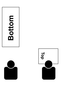
When we follow the edge direction, we might end up rotating labels in opposite directions from one another, like the example seen here.
This also reminded me that the ideal reading path is not always in line with the edge direction of the elements you are laying out.
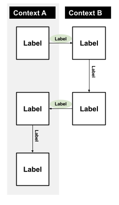
As is the case most often in horizontal labels, for which you would have to set the type upside down to maintain the edge direction matching that of the baseline.
Conclusion: What I’m teaching students
While standards do exist for some contexts (like diagrams for the process industry) and some people report that rotating their head to the left to read bottom to top feels more natural, while others report the opposite is true — science says that either direction is equally impactful on readability and a concept like “proper” depends deeply on context.
Where I have landed is that deciding on the “proper” orientation for your diagram labels involves a framework of considerations, and depends deeply on the audience you want to reach, the context of reaching them and the risks you are willing to take on reducing readability and understandability.
My advice is:
- Try everything in your power to not rotate the label at all
- If you have to rotate a label, make sure you aren’t obfuscating the edge direction as a result
- Don’t turn your type upside down, it’s almost always unreadable
- For the love of all that is typography, don’t stack/marquis set your diagram labels unless you have literally exhausted all other options – and if this is the case, at least use uppercase letterforms.
Footnotes
1 “Text shall be oriented horizontally or vertically corresponding to the reading directions viewed from the bottom edge or viewed from the right-hand edge of the document.” – ISO 15519 sec 5.1.5 (2010)
2“… lack of agreement in the matter persisted among English-speaking countries as late as the middle of the twentieth century, when books bound in Britain still tended to have their titles read up the spine …″ Petroski, Henry (1999) The Book on the Bookshelf
3“90 degrees in either direction is 205% slower on avg.” Huey, E. (1898) Preliminary Experiments in the Physiology and Psychology of Reading’. The American Journal of Psychology, vol. 9, 1898, pg: 575-586
4“the major factor determining reading speed was the mismatch between the orientation of the text and that of the reader” Firth, Machin, and Watkins (2007) Reading sideways: Effects of egocentric and environmental orientation in a lexical decision task
5“At the beginning of every new line the reader is focused, but this focus gradually wears off over the duration of the line” E. Ruder (1967) Typographie
Help me make more sense of diagrams
I hope my findings in this rabbit hole were useful. I am currently writing a book about diagrams, so if you see articles, books or other materials I could be looking at as I work, let me know!
Also if you want to keep up to date on what I am working on, consider joining my mailing list.