Information Architecture for Navigation
My first introduction to information architecture “as a job” was in the summer of 2004 when I delivered a set of icons to a consultancy who was building software that I knew basically nothing about.
Someone I met by phone off of a Craig’s List post had emailed me a list of verbs (print, save, edit etc) and basic image specifications for the icons they needed. I then used those inputs to make some nice-looking, albeit basic, warm gray, modern-for-2004 icons to their specifications.
Then I drove them (in a rental car, on a Jazz drive, lol) to an office park in New Hampshire. [Pause for xennial flashbacks]
While I was finishing up chatting with the project manager, the software architect asked me if I wanted to see my icons in the software. I was, of course, eager.
What I saw was a horrific nightmare. My icons, which felt thoughtful and clear on PDF, felt imposing and nonsensical in this navigational context. And what happened next would ultimately change the trajectory of my entire career.
I said something like:
“Oh no, you can’t use those icons like that!” – and this spurred a conversation in which I was asked a critical question: “Do you know what information architecture is?”
Now my dear reader, I thought I did at that time know what information architecture was. But spoiler alert: I (a classically trained graphic designer in her early twenties) actually had little clue about what IA meant in context to working on navigation systems for enterprise software.
“Of course I know what information architecture is! I’m a graphic designer!“
– Me (confidently)
The conversation after that is a blur of whiteboards and sketched-out menu systems that ultimately resulted in my first contract job as an information architect. This experience also spurred me buying a copy of the polar bear book and spending the next few years entirely reassessing my career path while reading everything I could get my hands on about information architecture in the context of digital design.
Since that day I have been learning and growing my skills of influencing ever-complexifying types of information architectures. And the witchcraft-level artistry that is ‘Navigation Information Architecture’ is a skill I am proud to have massively improved on practicing (and teaching others) over the two decades of trying to keep up with the navigation trends of the moment.
When was your first navigation design?
The first taste many designers get of complex information architectures in practice is when designing a navigation system.
We designers are inherently considerate of IA concepts like “content matching intention”, the importance of clear typographic hierarchy, and how to make sure you don’t lose people through design tactics like visual symbolism or color-coding. But it’s not until we are given a design task that involves getting people from point A to point B that we finally dig into the real value of information architecture in terms of making sense of system-level messes.
Information architecture is the way we arrange the parts to make sense as a whole. And when it comes to designing digital products like websites and mobile apps or designing physical experiences like events or exhibits – navigation is really where a designer’s IA skills shine (or prove to be incredibly painful)
As a teacher I find that oftentimes designers are thrown to the proverbial wolves when it comes to the information architecture part of navigation design. Some designers are taught early in their career how to zoom out and make decisions across places within an experience – but far too many are not taught this early enough (and some it seems have never been taught this part at all)
If any of that sounds like you – hello, I wrote this (rather long, sorry not sorry) article for you. It is intended as a beginner’s guide to determining the information architecture of any navigation system.
How to Make Sense of Any Navigation System
The information architecture of a navigation system includes consideration and planning in at least the following ten key areas:
- Intention: What purpose does the larger system have?
- Roles: Who will be navigating the system?
- Permissions: What will each role have the ability to navigate?
- Interface: What UI elements are presented for the purpose of navigation?
- Labels: What is signaling meaning about what navigation leads to?
- Projection: How does this navigation communicate what this system has to offer?
- Direction: Which paths are navigation-enabled? Is logic or role involved in what is enabled?
- Accessibility: How is this navigation system used by people who lack access to abilities like mouse or touch screen use?
- Alerting: How can we get extra attention on something at the navigation level?
- Governance: How is change made to this navigation system over time?
Below I introduce each of these key areas and outline actionable steps meant for anyone just starting out in designing a navigation system, and wanting to make sure the IA part is solid.
Intention
The first step in determining the right information architecture for a navigation system is to understand and be thoughtful about the intention you have for it.
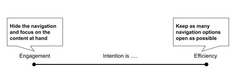
For example: Is the intention of this navigation system about efficiency? Or is it meant to inspire engagement? Because the navigation systems that you design for each of those different intentions might differ rather drastically.
In the case of efficiency we might prioritize displaying more navigable options in an effort to give the user ultimate access to lots of paths.
An example might be designing the logged-in portion of a bank or insurance vendor’s website. For a product like this you would want to make all the options clear, and available to meet a diverse list of quick needs.
In the case of engagement we might limit the navigation and focus instead on immersion in where they currently are in an experience.
An example might be designing a product with a news feed. For a product focused on engagement you would want to make all the navigation slide out of the way of distracting the user from the current experience.
While the larger intention we have for the product is essential to knowing the approach to navigation that might be right. Many navigation systems have intentions across a wide range on this spectrum, with specific flows or areas of the product falling more to one side or another.
For example on a social media product, the navigation in the main product might intend to support engagement, and yet the area of the product where permissions or privacy are managed might be more efficiency-oriented to get people moving on with their task and back into the engagement.
Questions to ask about intention:
- What is the intent of the system you are designing the navigation of?
- How does navigation support that intention?
- In what cases might the intention for the navigation have to differ from the intention of the system to support a discrete task?
- If you are redesigning a navigation – what do users currently struggle with in regards to the navigation? How does the navigation stand in the way of your intentions for the user’s experience?
Roles & Permissions
Closely coupled with the question of our intentions for our navigation system is “who” is doing the navigating and what places do they have access to navigate between.
- Permission: The level of access to content and/or functionality within a system
- Role: The permissions provided to a type of person within a system
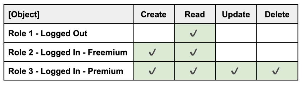
For example, on many service- and content-oriented products there is a logged in vs. logged out experience. Sometimes once logged in, there is also an additional change in role & permissions based on how much the customer pays for the service.
- Role 1: Logged Out
- Role 2: Logged In – Freemium
- Role 3: Logged In – Premium
Not only is this detail important for developing user empathy as a designer, it is also a matter of logistics around how much navigation variability there actually is to be accounted for in each role.
When I was early in my IA education, an engineer I was working with taught me about C.R.U.D (create, read, update, delete) which is a simple framework for considering the entire lifecycle of core objects in the context of roles and permissions. Examples of core objects might be a post, video, profile, feed, order, cart, document et al.
To more fully explore roles and permissions we can map each core object in the system to the core actions that system supports users in accomplishing:
- Who can create it?
- Who can read it?
- Who can update it?
- Who can delete it?
Since this acronym was first created to project computing in the early 1980s there are other verbs that have arisen and continue to arise from a common, more modern product context that you will want to spend time understanding your unique needs around.
Examples of additional modern core verbs might include:
- Who can share?
- Who can like?
- Who can friend?
- Who can duet?
- Who can message?
- Who can monitor?
- Who can remix?
- Who can proxy?
Sidenote: Thank the universe for people who edit wikipedia to include gems like the below list of alternatives to CRUD:
- ABCD (add, browse, change, delete)
- CRUDL (create, read, update, delete, list)
- BREAD (browse, read, edit, add, delete)
- DAVE (delete, add, view, edit)
- CRAP (create, replicate, append, process)
The below matrix exercise can quickly yield clear patterns as to how many roles have to be planned for navigationally – and what level of variation to plan for.
One of the most common mistakes I see designers make in navigation IA is having to account for these role-level details too late in their designs. This opens up an opportunity for navigation to be added like sprinkles, and too often leads to less than stable results for the user navigating the system.
Understanding Supersets & Subsets
Another helpful concept when it comes to role and permissions is supersets and subsets.
- Superset: The largest, most complete set of all navigation options available
- Subset: The smaller, defined set of navigation options available to specific roles
In my experience teams are only really successful on navigation implementations when they design a navigation system to tolerate everything between the known superset and the often-less-known-and-hella-variable subset needs of expected roles.
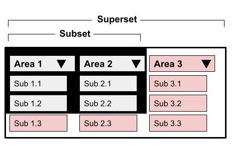
For example if you were working on a product that has both a free access level as well as a premium access level to unlock the full suite of features or content, you would need to design your navigation system to tolerate both the subset of free and the superset of premium.
When we work on navigation systems I have noticed two places we can really screw this part up:
- Not designing for large supersets
- Not adjusting for small subsets
Designing for Large Supersets
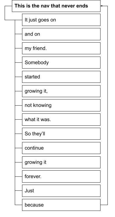
Sometimes a product has a truly immense number of navigation items to be organized. But in some of these cases, that immensity is only for some users. Both superset and subset users suffer if the navigation system with a large superset isn’t resilient to a range of permissions.
For example, sometimes a super user role (like an admin) is forced to have everyone’s navigation piled on like some kind of cruel navigation superset sundae.
Actual footage below. Sing along if you know the tune …
In other examples superset users have so many navigation options that subset roles suffer from too much needless container navigation for their few purposes.
If any of this sounds like your product – I suggest you work to eliminate needless container navigation for subset users. And work with those super users to see if exhaustive navigation is really what they need at all. Sometimes these users are actually better served by dashboards or in-context, just-in-time information panels that thoughtfully bring content they need when they need it.
Adjusting for Small Subsets
On the other end of this spectrum is the user for whom the navigation subset is quite small. Sometimes you will see products who force smaller subset users through archaic drawer opening and closing in order to reach the few navigable options.
A common consideration of small subsets is:
“How much do users need to see what they DON’T have access to?”
In some product contexts showing users the full navigation but in a state that is “obvious it has to be unlocked” is an upsell tactic that works really well.
In other product contexts like an admin-level of a SaaS product, subset users often don’t need to be exposed to the bulk of the superset, nor the container categories.
The answer is not always one navigational approach to serve everyone. The answer is also not always to build every role their own special navigation. Instead the answer almost always lies in-between.
Questions to ask about roles & permissions:
- How many distinct roles are there to account for?
- What permissions does each role have within the system?
- What content, features and data differs by role?
- What content, features and data don’t differ by role?
- Do you understand the full lifecycle of the content enough to understand roles and permissions?
- What is the superset of navigable places?
- What are the expected subsets of navigable places based on your understanding of roles and permissions?
Interface
In my experience there are a growing list of interface patterns that are worth calling out as common in digital navigation at this point. And while these are not guaranteed to stand the test of time long term, each has at least a decade of common use organizing digital interfaces’ navigation systems.
To start this lesson on navigation interface basics, I believe it is useful to think about two overarching approaches to navigation interfaces:
- Unfurled Navigation: When navigation options are prominently marketed to users during use
- Furled Navigation: When navigation options are hidden away until sought out by the user
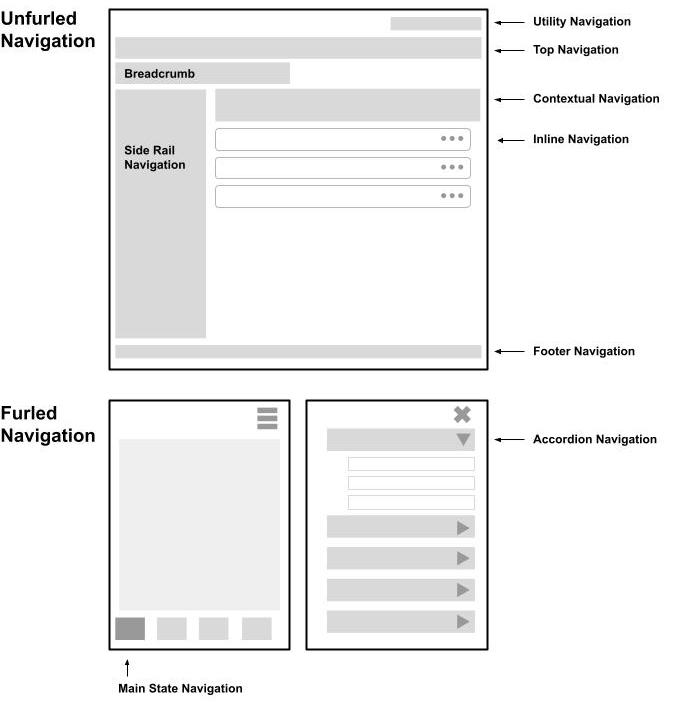
Ten Common Digital Navigation Interfaces
Below you can learn about the use and usefulness of what I consider to be ten of the most common patterns that digital navigation interfaces lean on:

Breadcrumbs are a navigational trail of how the current content relates to the site or user’s experience of it. They are an incredibly important wayfinding feature for many content-heavy environments as they provide strengthening to the ever illusive “sense of place” users need to feel comfortable, especially in the digital depths.
There are generally two ways breadcrumbs are implemented, with each having use cases it supports:
- Architectural Breadcrumbs: A hierarchical trail of where the current page lives in an architecture, which is good for supporting bottom-up experiences like landing on a product page from an external search result.
Example: Clothing > Tops > Tanks
- Behavioral Breadcrumbs: A sequential trail of where a user has been prior to arrival on a particular page, which is good for providing context to the user as to how they got to their current location, and, if applicable, easy access back without relying on the back button in their browser (... which if you don’t know already can really screw up a flow y’all!)
Example: Step 1: Create Account > Step 2: Add Request > Step 3: Upload Photo ID
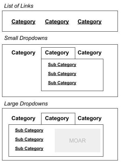
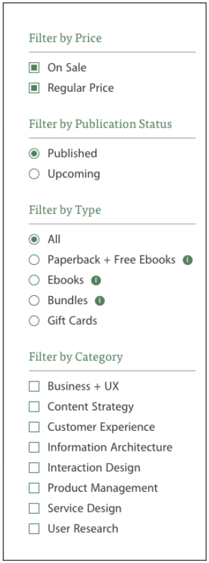
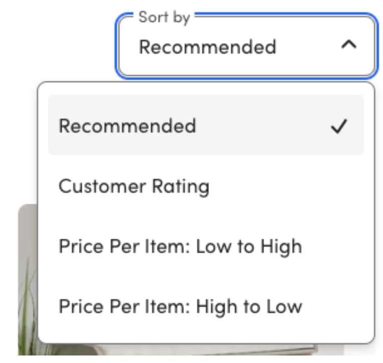
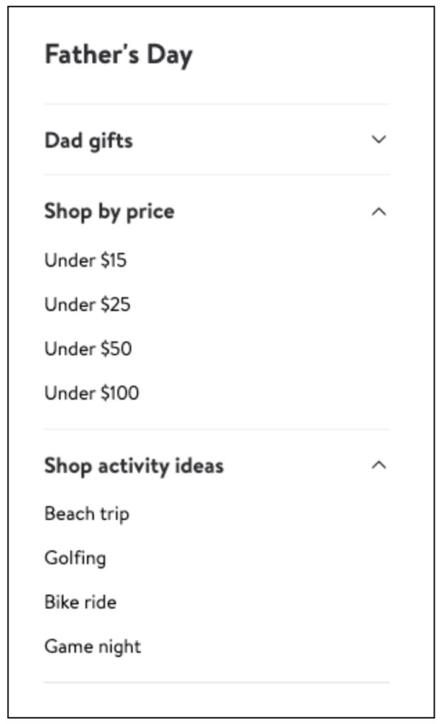
You see this pattern used in a few common cases:
- Faceted filters to limit search or list results (see example below)
- Secondary navigation within the content
- Unfurling navigation that might be of interest given the current location
Source: Rosenfeld Media
Contextual Navigation is navigation within or between areas of the page or section’s content. Two of the most common interface elements I see in contextual navigation are:
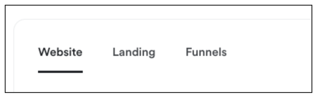
Source: Wayfair
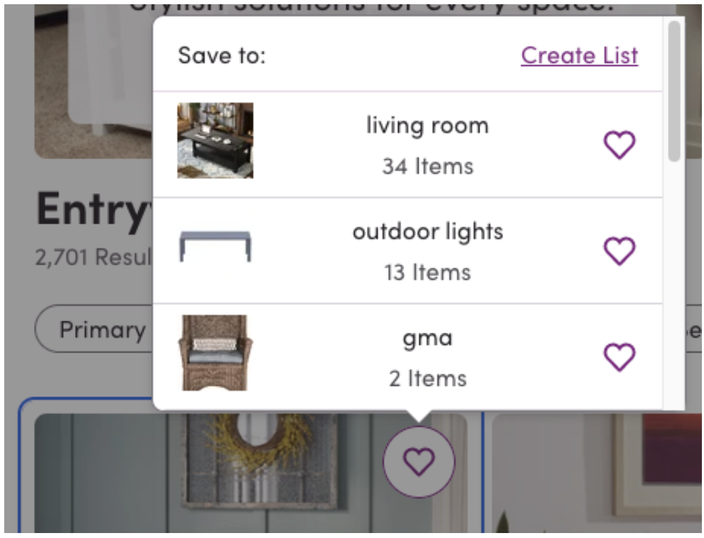
Source: Wayfair
Footer Navigation might have a bad reputation as a common place for lesser-needed or obligatory links. But it is also a great place to include your site’s hierarchical semantic structure so the search engines (and AIs) of the world can better understand your site’s value to users – especially if you have made that hard for them through use of fancy, furled menu systems.
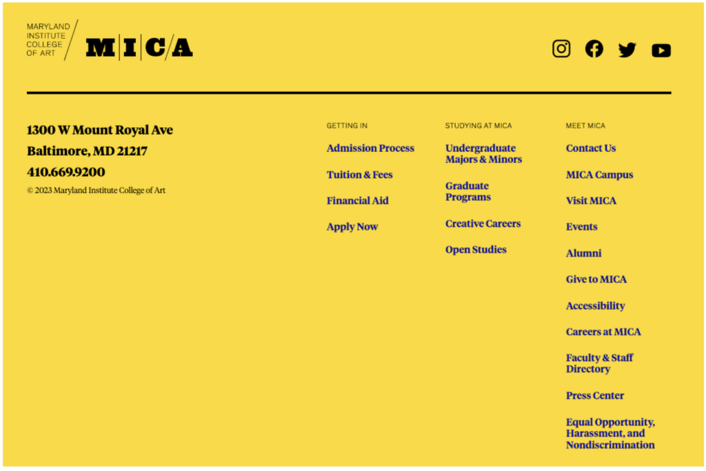
Source: MICA

Source: Costar
WARNING: The IA devil is in the interface details
Pay special attention to the way navigation menus move and react to movement. In many cases what seems like a stellar information architecture decision for a navigation system on paper needs to be rethought out entirely in context to the quality or details of the interface’s design and technical implementation.
Watch out for overburdening a side rail, contextual or inline navigation component with a super set that is too big for the interface chosen. Also beware if the same navigational system is expected to persist across small and large screens but has been obviously designed with larger screens in mind.
Questions to ask about interface:
- How much real estate can be allocated for navigation?
- How furled or unfurled should the navigation be to support expected use?
- Which common navigation patterns might you lean on?
- What navigation needs are unique enough to your context to require a new pattern?
- If so – How will users get to know that new pattern?
- Do the implementation level details about design, motion and engineering of the navigation interface maintain the intended results?
Labels
Navigation systems are made up primarily of labels. As such, labels are the primary determiner as to whether a user will understand a navigation system or not. Whether labeling your navigation using words, imagery or a combination of both – the labels you choose for navigation systems matter greatly to their clarity and success.
By my estimation labels have to do two things:
- Make sense to your intended audience
- Support your unique intention
Sounds simple, right? Hmmm… anyone who has worked on a set of labels for supporting navigation before will perhaps have a different impression of how hard that short list of criteria is to meet.
I learned a hard lesson around labels in the process of writing a book about diagrams. I realized that one of the reasons labels can feel so fraught stems from how early in the process labels become essential to our process when making pretty much anything. We speak and write about “the work” before even doing it – no matter what the work is.
Putting a label on a thing changes that thing, if only ever so slightly. If I tell you we are going to a BBQ you would prepare differently than if I told you we are going to a Soiree. Your expectations for what to expect change dramatically based on how a thing or experience is labeled.
When making products we are forced to pick labels for things like navigation so early that we can make the mistake of now knowing enough yet to be making such important decisions about what to call things, or groupings of things.
The best guidance I can provide as a teacher to combat this common concern in navigation is to teach you to think about labels in the following three phases:
Phase 1: Labels to Get By
When we first start determining our navigation system, we are using labels to sketch out a broad approach to the way the system will be navigated and used.
At this stage we can use labels that are clunky or not quite there yet because we don’t know that much yet and arguing about the fine tuning of labels at this point might prove more distracting than useful.
It is more important to know that all navigable connections have been sketched in than it is to have good, clear labels for the places being connected. The labels can be placeholders that express intention, and not yet words that feel like users would understand or interact with them.
Phase 2: Labels to Get Through
As we start to come upon a solution that we need feedback from users on, we will want to land on some slightly improved labels that help us at least properly indicate our intention but pre-research these labels are only our best guess.
These labels can still not be quite right. It’s perfectly reasonable to assume many of the labels might change as a result of getting feedback.
This is also often about time for the labels and designed user interface to meet in the most realistic contexts, so we can see what happens. Don’t be surprised if that’s another layer of feedback all on its own.
Phase 3: Labels to Get Results
By the time the navigation system is being constructed we are able to rely on the labels we landed on to get the results that we are after.
At this point your labels will have been tested for their effectiveness with your target audience in the intended interface. If that’s not yet the case, go back to step 2 and work on getting through.
Common Labeling Mistakes in Navigation:
- Thoughtless Truncation: When designing a navigation we need to consider what various breakpoints and screen sizes will do to our navigation systems as well as the availability of all the labels we put such thought and love into. When this is handled, badly navigation can get truncated down to a place where the labels are asked to do a different job than ever intended.
- Rigidly Designed on Label Length: Navigation systems need to be resilient to labels of various lengths unless other label length governance is in consideration. A word of warning: if you are designing a navigation system and there is not a systematic character limit, it is a “when” not an “if” someone breaks your system.
- Inconsistent Grammar: Whether it is mismatched parts of speech, unclear tense, inclusion of weird determiners (i.e. your, my) or an inconsistent use of plurals – there are a myriad of ways that navigation labels can feel like they don’t quite belong with one another. If it sounds weird to read your navigation out loud, it’s probably weird to use it as navigation too.
Questions to Ask about Labels:
- Do the labels you chose make sense to your intended audience?
- Do the labels you chose support your intention?
- Have you considered how various breakpoints will truncate or otherwise change your navigation interfaces?
- What systematic limitations are in place around character limits for navigation labels?
- How does your navigation sound and feel when read aloud? Are there any obvious hiccups of grammar?
Projection
Along with supporting the mode you expect your user to be in given the tasks at hand, you also have the chance to reiterate a product’s ethos through the way your navigation projects your intention.
Navigation systems are like tour guides and I think we can all agree that the way a tour guide presents the tour matters deeply to how the rest of that experience feels.
In my humble opinion navigation can be one of the clearest expressions of brand, tone and voice if we let it be. When living their best life, navigation systems allow us to project the best version of ourselves.
When I worked at Etsy we ran some navigation research where we recruited users without any Etsy brand awareness. We asked them each to describe what they thought the site was from what they could see in the navigation.
They determined it was “a-lot like Kmart or other discount shopping place” and statements of the like – which for a hip, brooklyn based eCommerce rising behemoth was very “shudder, cringe, yikes” feedback to hear – and ultimately a major driver in selling the return in investing in rethinking the main category navigation for the site.
My point in sharing that anecdote is to make sure it is clear that even when the branding, products and interfaces feel hip and fresh, if your navigation sounds or feels crusty and dusty – your true intention will be overshadowed and users will even make stuff up about who they think you are and what you stand for.
Questions to Ask about Projection:
- How do the labels you chose project your intention?
- What might your ideal audience walk away believing if they were to only read the navigation?
- What clues to your ethos is the navigation able to provide?
- How can you surprise or delight your audience with the language choices you make?
Direction
The direction part of any navigation system is whatever mechanisms are needed to direct a user to feel confident about three basic things:
- Where they are currently
- What’s possible and not possible where they are
- Where they are allowed to go from here
This is an especially important concept in digital navigation design because unlike physical locations, users are dropped into random depths of a digital place without any understanding of how deep or far away they have traveled since their last location.
Here are some of the basic patterns we can use in communicating the details of direction within a digital navigation system:
Selected/Unselected State
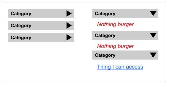
When we design navigation systems it is incredibly important to understand the state of the navigation on each page, as it will appear for each role. Whether it is a change of contrast, color or shape, having a clear visual selected/unselected state on your navigation interfaces can do a lot of work to maintain a sense of place.
Breadcrumbs
When we drop folks onto random places at the depths of our digital products they will rely on interface elements like breadcrumbs to realize where they are, and why. This feature is also great at tempting the user to go from a single object to a list of similar objects, which is a popular and effective strategy in eCommerce.
For example, if a search result lands you on a “tank top” a breadcrumb might link you to a parent category for “tops” and a grandparent like “clothing”
Movement
When trying to establish a sense of place for our users we can use movement to reveal to them how the navigation is meant to work, or perhaps where it is hiding out until they need it.
For example, it can be effective to have a menu that opens slightly and closes as the user loads the interface. Another example of this is when the cart icon shakes up in the corner of the screen when you add an item on a shopping site. We can use movement to give the user important directional cues about where to go next.
Questions to Ask about Direction:
- How does the user know where they are?
- How does the user know what they can/can’t do where they are?
- How does the user know where they can go from here?
- What creative elements (such as movement and selected/unselected states) can you use to reinforce your information architecture decisions in this navigation?
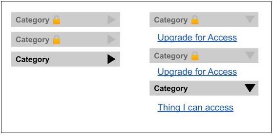
Accessibility
If you had a physical storefront, among other accommodations, you would have a ramp, as well as a handicap accessible door to make sure people of all abilities would be able to access your business.
The same must be done when it comes to digital places and their navigation.
If you didn’t already know, this level of thoughtfulness is not only a kind, inclusive thing to do – it is also the legally mandated thing to do. In fact businesses can be severely penalized for the lack of accessibility accommodations. In one example Target agreed to pay class damages of $6 million for a lack of accessibility accommodations including lack of accessible navigation.
The good news is that there is a ton of available documentation as to how to make your navigation systems (and products as a whole) accessible. The bad news is that accessibility gets harder to implement gracefully the longer you wait to figure out the accessibility … especially of your navigation.
For example, if you were to wait until you were well into the design or even worse the implementation to add accessibility accommodations, well good luck hitting that launch date my friend.
If you are just learning about accessibility as it relates to your product, here are a few of the basics to get you started:
- ICT Accessibility 508 Standards and 255 Guidelines will let you know the bar you need to meet in order to be legally compliant
- Here is a great introduction to accessibility provided by the US Government. It is well worth a read if you are new to accessibility as a whole
- W3C’s Guidance on Menus will give you more details about technical implementation of accessible navigation systems
- This is a useful overview on how to meet the WCAG 2 standards from the W3C
Also if you are just learning about this and you work on a digital product, please raise a flag at your organization about the importance of this kind of commitment. You will certainly do better by your users, and you might even save your organization from a costly legal issue down the road.
Questions to Ask about Accessibility:
- How much investment have you made into the accessibility of your product?
- How WCAG compliant is your product today?
- How do keyboard users navigate your product?
- How do screen readers navigate your product?
- Are all states of navigational controls adhering to an adequate contrast ratio?
- What other accessibility accommodations would help users given your unique product context?
Alerting
Let’s say that you just shipped a beautiful navigation redesign project. It is live and being enjoyed by users and all is well.
Suddenly – a team approaches. They have a new shiny thing, and they need that new shiny thing to be not only added to, but also prominently featured on your beautiful new navigation system.
Welcome to the most common place where navigation starts to erode: Alerting!
Whether it be letting people know something is new with a badge on the navigation, or incrementing a count on an icon – alerting is a strategy that most navigation systems need to thrive long-term.

Here are some basic common use cases for alerting in navigation:
- The user needs to know something has changed
- Something is being counted
- The business wants to alert the user to something that supports business intentions
In all cases I see three important strategic questions that are ideally discussed before the time comes where requests for alerts start to occur:
What density of alerting is appropriate for one user at one time?
If everything is important, nothing is important. Density is an important metric to have in mind when working through alerting strategies, because in complex systems it can mean that you have a need for an explicit alert architecture to manage how many and the conflicts across various alerting sources.
Check out this thoughtful alert architecture from Slack.
What is the priority of NEW vs. Evergreen?
When a part of the business wants to alert a user it is often because something is new (or newly on sale). When navigation systems are constructed, ‘newness’ must be addressed if you want to avoid your navigation slowly eroding in intention overtime as new things are added and prioritized because of their newness. An interesting way to think about this is in the priority of new content and evergreen content as compared to some other important metric like engagement or revenue.
How does the alert go away?
If you are adding an alert to a navigation, there must also be a tactical plan for when and how that alert goes away. There are three patterns I have seen, to various levels of success:
- Set a time for it to go away. For example, a brand running a holiday sales alert on their navigation might have an end date/time for removal of that alert when the holiday sale period is over
- Set a timer, or # of interactions for a specific user. For example, a marketing team wanting to draw attention to a new feature might alert that new feature to target users for X times before it no longer shows
- Dismiss alert after a specific action from the user. For example a social media product will add an alert mechanism to a user’s navigation to show there are X new messages, mentions, friend requests etc but the alert will go away as soon as that area is interacted with enough by the user.
Questions to Ask about Alerting:
- What potential use cases need to be accounted for in the future of this navigation system?
- Who are potential requestors of these use cases? (Heads up, you’ll want to talk to them ASAP)
- What is the appropriate density of alerts for a user, and how is that managed?
- What is the strategic approach to dealing with newness and its balance with evergreen navigation?
- What is the agreed to criteria for something to require each level of alerting being discussed?
Governance
Even if you totally rocked it on the navigation redesign front, alerting is unfortunately not the only place where navigation erosion happens over time as the system grows and changes over the course of its life.
In my experience to counteract the impact of these inevitable changes you must work through some form of governance while concepting and constructing your navigation. Governance is the process and rules we put in place around how to maintain a system overtime.
The best way I have seen navigation governance done is by taking on three things as a organization:
- Creating a cadence of regular check-ins with a group of invested stakeholders to discuss navigational performance and potential needs for change
- Instituting a style guide and controlled vocabulary for navigational elements (preferably as part of a larger design system within the organization)
- Iterating through an effective change management process for making changes to the navigation including a documented and agreed to set of criteria for what goes on and doesn’t go on the nav
With the right governance systems in place you can lengthen the useful life of your navigation system tremendously. You can also build a great pipeline for iterating on the navigation based on performance metrics. Win, win.
Questions to Ask about Governance:
- What cadence of change to navigation do you expect?
- How will any navigational changes be considered, implemented and measured?
- Who in the organization would be a useful ally for navigation longevity?
- How is the navigation’s effectiveness measured long term?
In Closing
If you made it to the end of this incredibly long article, thank you for your time and attention.
Whether you are designing a complex navigation system for a SaaS product, or the simple navigational controls of a mobile application I hope the above considerations and thought starters help you to make the unclear, clear.
✍️ If you enjoyed my thoughts on this topic you might also enjoy reading these other related articles:
- Structural Arguments for Information Architecture
- What is the return on investing in information architecture?
- Sitemaps for Beginners
🤓 If you are ready to go from curious to confidently practicing information architecture in your own context, consider becoming one of my students by registering for The Practitioner’s Guide to How to Make Sense of Any Mess. This course includes access to my LIVE monthly office hours.
👯If you have a team looking to level-up their information architecture skills, I am currently in development of a long-form course for teams who need to improve IA as a core collaborative skill.
💌 If you want to keep up with the latest from me, join my monthly email list. And if you found this to be of value, I would be so appreciative if you sent this piece to anyone else who might also find value in it.